 Can you hear it?
Bounce, bounce, bounce.
No, that’s not the distant sound of the discotheque down the street. That’s the sound of visitors leaving your landing page. Visitors you’ll never see again.
Something on your landing page is throwing your visitors off and making them turn around.
Your landing page may be hiding a conversion killer.
Can you sleep peacefully, knowing that you might be driving potential customers away?
Let’s put those fears to rest today. Let me show you how to find those conversion killers and turn them into conversion boosters!
Designed (not) to Convert
Your landing page is one of the most important pages on your site. It’s where a majority of your leads and sales will come from.
As a result, if you make a mistake designing your landing page the effect is much more detrimental to your business than if you made the same mistake elsewhere.
At Thrive Themes, we’re all about conversions. In a recent case study, we asked our audience to send us their landing pages for review and optimization. Entries came in all shapes and sizes, but a few specific and fundamental mistakes kept cropping up over and over again.
Conversion Killer 1 – Why Should I Care About Your Offer?
Harvard Business School professor Theodore Levitt: “People don’t want to buy a quarter-inch drill, they want to buy a quarter-inch hole!”
One of the biggest mistakes you can make designing your landing page is to focus entirely on describing your product or offer.
Feature: What is it?
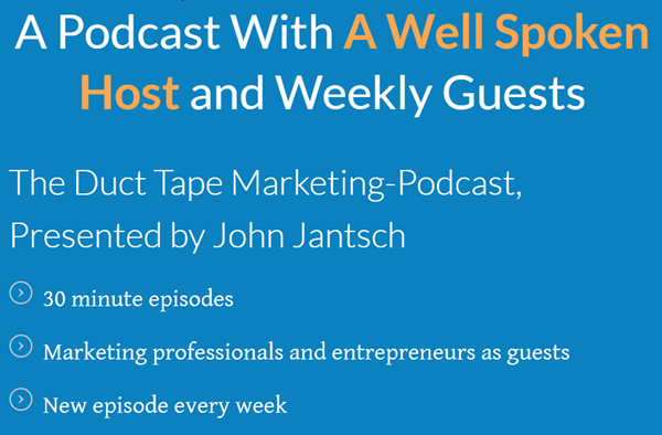
When your reader first finds your content, they’re not interested in a detailed description of your offer. All they want to know is why they should stay. That’s why your landing page must illustrate the benefit of your offer.
Presenting the DTM podcast in a very blunt, feature-oriented fashion. Doesn’t sound too interesting, does it?
Benefit-oriented: Why should you care?
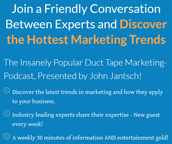
Here’s the same podcast, presented in a different light. Suddenly you feel engaged as if part of a story.
These examples are, of course, deliberately exaggerated. Everyone who does marketing stuff has heard of features vs. benefits, and most of us think we’re doing it right. What we’ve found is that a lot of people still make this mistake, even if to a lesser degree.
In other words: Just because you’ve heard of emphasizing benefits over features doesn’t mean you aren’t making this mistake right now.
How do you fix it?
- Think about the questions “Why should I care” and “What is it.” With this in mind, read every paragraph and line of your landing page.
- Make sure every line is an answer to “Why should I care.”
Conversion killer 2: Drowning Your Conversion Goal in Distractions
Have you ever landed on a page looking like this:
See how many objects stand out on the page? You don’t know where to click. So many bright objects demanding your attention that you’ll be forced to click yourself out of there before decision paralysis kicks in.
Your navigation bar, your social share buttons, and your popular content links are great elements to have on your homepage or blog page. Visitors to these pages are generally the ones who have already decided to stay and look at your content more closely.
New visitors, though, they might not know who you are or what you can offer them. Your new visitor needs one single benefit to give them a reason to stay and subscribe.
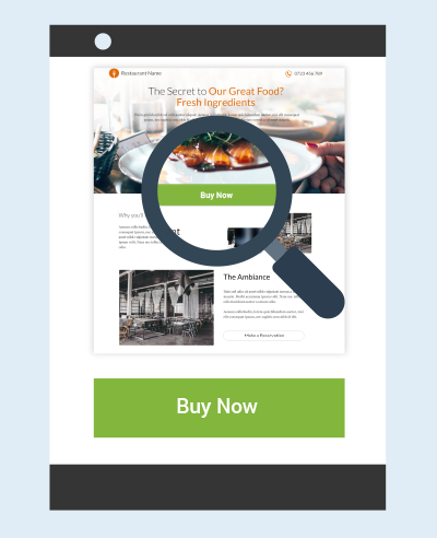
That’s why we design a landing page leading the visitor toward a single goal, usually a subscribe button or buy-button.
How do you fix it?
- Design your page with only one attractive element, brightly colored to contrast with the rest of the content.
- Remove any other distractions. Anything that isn’t explicitly helping your conversion goal needs to go.
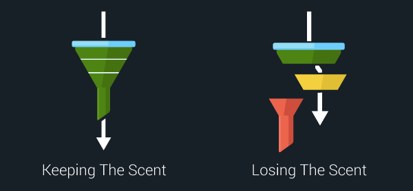
Conversion killer 3: Failing to Keep the Scent
Your sales funnel isn’t so much a collection of different elements linked together, but a solid pipeline with a single thought and purpose.
If you’re designing your ads or writing your guest posts separately from your landing pages, it might lead to a disconnect in your funnel.
Logistical disconnect:
Your ad promotes one specific offer with a specific benefit but links to your homepage. Your visitor needs to click through your navigation or look through several other offers to find the correct one. At that point, they’ll feel quite confused.
Disconnect in look and feel:
Your ad is bright and colorful but leads to a landing page that’s dull and clinical. Your visitor feels they ended up in the wrong place.
Value proposition disconnect:
Your promotional ad says “Get Your Free Business Coaching Session!”, but leads to a landing page with a business coaching video. Great video, but your visitor might feel lost after expecting to sign up for a live coaching session.
These sorts of things make your visitor think “Hang on, am I supposed to be here?” When you look at this from a visitor’s perspective, the problem is obvious. But how can you design your pages so that they surely keep the scent?
How do you fix it?
- Run through your own sales funnel. For every step, try looking at it from the perspective of someone who knows absolutely nothing about your website or business.
Pro Tip: If you feel unsure about a part of your funnel, you can pinpoint the problem with tools like Hotjar. Surveys and heat mapping can be the key to reading your visitor’s mind.
Silence the Bounce and Boost Your Conversion
If you found yourself guilty of the above mishaps, you know what you need to start changing to bring in results.
Remember to measure results before and after every change you make, so you know what’s working and what’s not.
Let’s be honest, though. Going back to eliminate conversion killers can be exhausting. It’s much easier to design the page from the ground up with no such flaws. Check out how you can do it with our free RAPID landing page course!
Silence the bounce. Sleep like a baby, knowing that your leads are safely clicking through, as they should.
 Jay Pitkänen is passionate about copywriting, inbound marketing and turning marketing jargon into something humans can understand. When he isn’t waxing lyrical about conversion optimization on the Thrive Themes blog, you can find him roaming the streets of major European cities looking for business opportunities.
Get our Best FREE Resources!
Download a copy of our best free ebooks for agency and small business business owners.
OR


